Credits to Daniel Doan
___
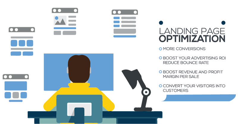
I’ve been doing digital marketing/growth hacking for quite a while now (going on 7 years), and here’s what I’ve learned so far to get landing pages to convert A LOT better (30-50%+ conversion rate with warm targeted traffic).
Whether you’re creating a landing page for your lead magnet, launching a new line of eCommerce products, or prepping a page for your new SaaS startup, or anything else that involves driving traffic to a website, these tips might help you out in one way or another.
I’ve broken the tips down into seven categories: Understanding, core offer, call to action, trust, layout, psychology, and post-signup.
–
1. UNDERSTANDING
Do you truly understand your customer? You should have clear and data-backed answers to the following questions:
✔ How do people want to feel after seeing success with your offer? (If your SaaS product legitimately boosts their conversion rates by 15%, saves them 20 hours per week, *AND* cures male pattern baldness… you need to litter that in your copy.)
✔ Do you know their deal breakers, uncertainties, fears, and doubts? (If you’re not sure about this, search reddit for relevant threads and dig through the comments.)
✔ What separates your offer from others? (If you’re offering the same thing at someone else with very little to differentiate yourself, you’ve already lost.)
✔ Which emotions and/or situational triggers drove users to sign up? (Interview or survey your initial cohort of customers/subscribers and find out what triggered them to finally move forward. Then, double down on eliciting this emotion on your landing page.)
✔ What is the desired outcome that the user is trying to achieve? (Surveying customers is important here. Many times, the perceived desired outcome of the person creating the landing page can wildly different from the reality of the people hitting the page.)
–
2. CORE OFFER
Is your core offer strong enough? You should be cognizant of the following ways to improve the landing page:
✔ Having a clear and concise headline and subheader that answers “what is it?” and “what’s in it for me?” (This goes without saying, but the two most important lines of copy on a landing page is the header and subheader.)
✔ Designing the landing page to be consistent with the referring source (If the landing page differs wildly from the referring source in terms of aesthetic, copy, or design… conversion rates will plummet.)
✔ Having the offer be personalized for a single specific target buyer persona (Landing pages should target exclusively one buyer persona. I’ve seen so many “franken-pages” filled with copy targeting multiple buyer personas at once. This never ends well.)
✔ Having the deliverable be depicted with imagery or video (It goes without saying that the deliverable must be clearly shown, and that the use case of the deliverable needs to be shown as well. No exceptions.)
✔ Having bold claims which are immediately backed up by evidence and not pure hype (My personal rule is that there needs to be evidence backing up every single claim somewhere on the page. No unsubstantiated claims.)
✔ Containing three value-packed bullet-points right below the main header (A new pattern that has been doing well is having three bullet points below headers, including the primary header. Make things as skimmable as possible.)
✔ Having most of the value above the fold (Remember, 80% of readers will only look at 20% of the page, so the entire offer and value proposition must be presented there.)
–
3. CALL TO ACTION
Is the CTA strong enough and in the right places? This can be considered low-hanging fruit, but it’s important to keep the following in mind:
✔ CTA is immediately visible above the fold (This way, if they’re already a hyper-warm lead… they can instantly click through to get the offer.)
✔ Visible, action-focused, stands out, reiterated throughout the page, and descriptive (There needs to be multiple CTAs on a landing page. These CTAs need to clearly articulate the value of clicking on them, and should contain a verb.)
✔ CTA buttons reflect the appropriate stages of the buying journey (Don’t expect a cold audience to click “Buy Now” on your $2,999.99 offer. This never ends well.)
✔ At the footer, the copy should directly lead to a CTA with contextual wording (Make sure that the text preceding all CTA buttons should subtly and/or overtly nudge them to click the button.)
–
4. TRUSTING YOUR LANDING PAGE OFFERING
Does the landing page convey a strong enough feeling of trust? Building trust and authority are key, and you’ll want to make sure that all of these elements are present:
✔ Trust icons are above the fold and at the footer (Always be in the habit of throwing up trust icons whenever you expect someone to take an action.)
✔ Testimonials include name, photo, title, and business affiliation (Be as specific as possible with your testimonials. Make business owners make the mistake of having testimonials from people who can’t be verified and/or are not trustworthy sources.)
✔ Includes a privacy policy near the CTA (Having a privacy policy link can add a lot of trust and can make them more willing to opt into your offer.)
✔ Reveal your business address and/or phone number to increase trust (This works to reassure them that there’s a real human at the end of the other side.)
✔ Includes a human element above the fold (This can be something like a hero shot, a photograph of yourself smiling, a photograph of the buyer persona smiling, or something else creative.)
✔ Includes a chat widget for any potential questions (I personally like using Drift for this. If it’s an item behind a paywall, it helps to have a live chat feature to address their questions and concerns.
✔ Copy is easy to read, 100% free of errors, and has no broken links (Leave the run-on sentences at home. Hire a copywriter to do copy editing. Verify that the copy is as pristine and as on-brand as possible.)
✔ Includes an open invitation to ask questions via email if they still have any reservations at the footer (Some people may have reservations that aren’t addressed in the FAQ section of the landing page. Remind them that they can reach you via email to answer any questions that they may have.)
–
5. CREATING A PROPER LANDING PAGE LAYOUT
Is the layout appealing and functional? Take a close look at both UI and UX design, and keep these points in mind:
✔ Page and design guide the eye to relevant sections (Keep the layout tight and focused usability and aesthetics over bloat. Consult a designer if necessary.)
✔ Supporting images do not compete for dominance with CTA (Nothing hurts conversions more than loud elements competing for attention with your CTA button.)
✔ Design elements and copy do not feel cramped or cluttered (This is the common mistake that I see the most. When in doubt, add more white space.)
✔ Includes enough contrast between page elements (I see this mistake quite often as well. Make sure that there’s enough contrast between text, images, and background elements.)
✔ Includes enough large sub-headers to be skimmable at a glance (Every large chunk of text must have a subheader. No exceptions.)
✔ Does it look as good on mobile as it does on desktop? (Make sure that the page is mobile-responsive.)
✔ Length of landing page is appropriate for the offer (If it’s a higher-ticket or complex sale, you’ll probably want to err on the longer side. If it’s a shorter or simple sale, use your best judgment.)
–
6. PSYCHOLOGICAL TACTICS TO BOOST LANDING PAGE CONVERSIONS
Do you have psychological tactics in place to boost conversion rates? Be warned though, you can be cheesy and/or sleazy if you over-do it. Regardless, it’s important to include as many of these elements as possible:
✔ Includes at least two elements of urgency such as a limited offer or countdown timer (People need a reason to act immediately, or else they’ll delay their action. Don’t let them.)
✔ Highlights your competitive advantage to preemptively handle objections (The landing page’s copy should handle your buyer persona’s objections before they have a chance to internalize it in their head.)
✔ Include multiple uses of the word “you” in the copy (This can be cheesy if you overdo it, but if you don’t do it too much, then you’ll be okay… just space out the you’s accordingly and hopefully you’ll fly under the radar.)
✔ Highlights a potential dollar amount or time-saving factor in the copy (People love saving time and money, and they’ll go to great lengths to spend time and money to be more productive with their resources. Tap into this as much as possible.)
✔ Highlights at least two high-curiosity factor “branded” line items (It’s important to play up the curiosity factor. Come up with something compelling. Some potential names: “The Power Juicing Method” or “The 5 Pillar Method” – come up with some fancy names for your concepts.)
✔ If the user views the page for ‘n’ seconds and does NOT sign up, engage in a downsell (This is especially useful when trying to sell a higher-ticket item. If you can’t close them on the target item, create a lead magnet and pass that their way in exchange for contact info.)
✔ Add a reassuring line of copy next to the form field and/or CTA button (It helps to be reassured that their info is safe with you and that you won’t sell their email to a third party.)
✔ Does not contain anything that distracts from the #1 goal of the page (I’ve seen a lot of landing pages with distracting and competing CTAs… links to other websites, etc. – Don’t fall into this trap. Keep your landing pages hyper-focused.)
–
7. INCENTIVES FOR LANDING PAGE SIGNUPS
Are there enough incentives post-signup to increase the viral coefficient? Don’t forget to continue the value delivery after the opt-in. After sign up, keep these in mind:
✔ Provide a personal message and ask them to check their inbox (Better yet, create a video recording to thank them for purchasing/opting in, then clearly state next steps and expectations to move the relationship forward.)
✔ Encourage them to refer to a friend or colleague who may benefit (Strike while the iron’s hot and incentivize them to spread the word shortly after the close.)
✔ Provide a bonus in exchange for a social media share (Give them something extra for free in exchange for a Tweet.)
✔ Give a small bonus for free. No strings attached (Surprising them with more unexpected value will generate a ton of good will.)